work++ // 01Corporate website
Odashima Real Estate
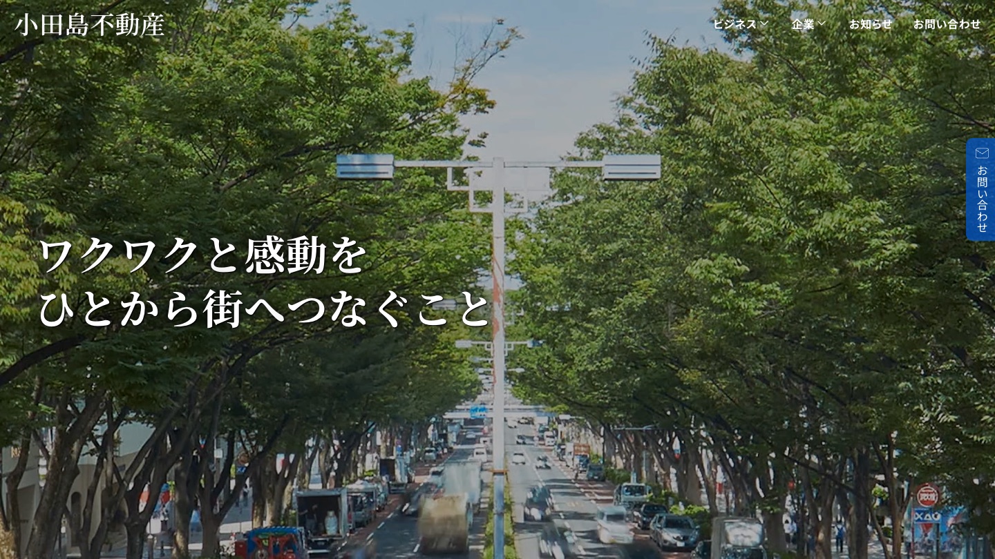
Overview
// overviewThis is the corporate website for Odashima Real Estate, an agency based in Omotesando, Tokyo, that specializes in luxury residences, retail spaces, and offices. We handled the entire project, from direction and design to development with a custom WordPress theme, and optimized the site for both desktop and mobile.
client++Odashima Real Estatecategory++Corporate websitescope++DirectionDesignDevelopmenttech++WordPressCustom themeurl++odaf.co.jp (opens in a new tab)
// case study
Challenge, Approach & Result
- 01 — CHALLENGE
Challenge
Odashima Real Estate’s website draws a wide range of visitors: property owners, people who search for the company by name, and prospective tenants and buyers coming from listing sites such as SUUMO. The challenge of this redesign was to give each of them the information they need and, ultimately, to encourage them to visit the office.
- 02 — APPROACH
Approach
To help every visitor quickly find what they are looking for, we proposed organizing the site into separate pages for each line of business, such as rentals, sales, and renovation. We also proposed a contact path that lets visitors call or email from any page, and linking property listings to athome and SUUMO to reduce the work of managing them.
- 03 — RESULT
Result
With pages organized by line of business and a contact path available throughout the site, we expect visitors of all kinds to find what they need and move straight on to a consultation or an office visit. Because listings no longer need to be managed in two places, the site will also be easy to keep running after launch.
// screens
Screens
screen.01 — PC
01 / 03Topodaf.co.jp/
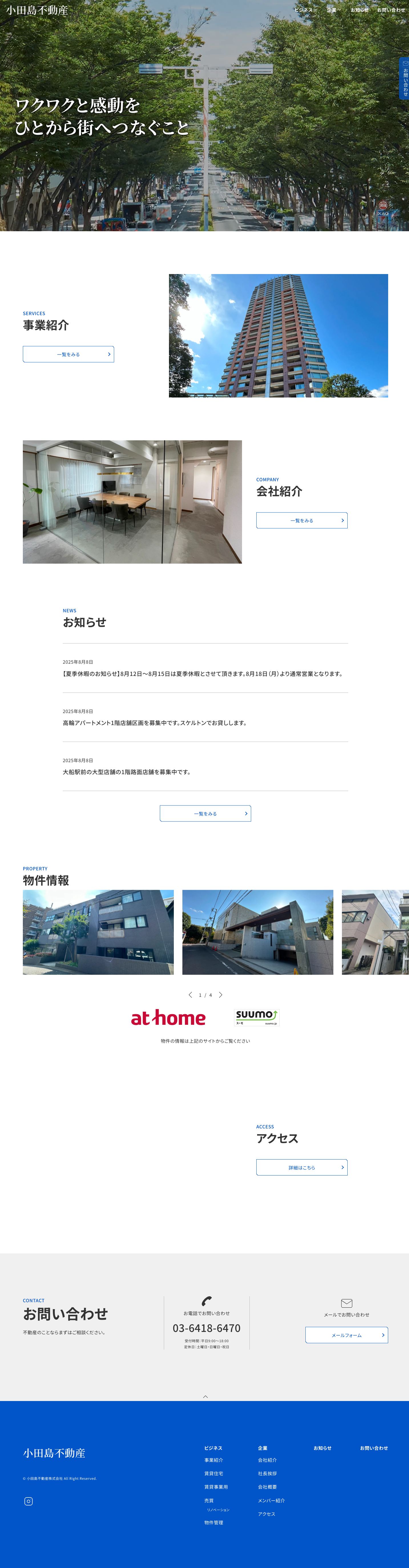
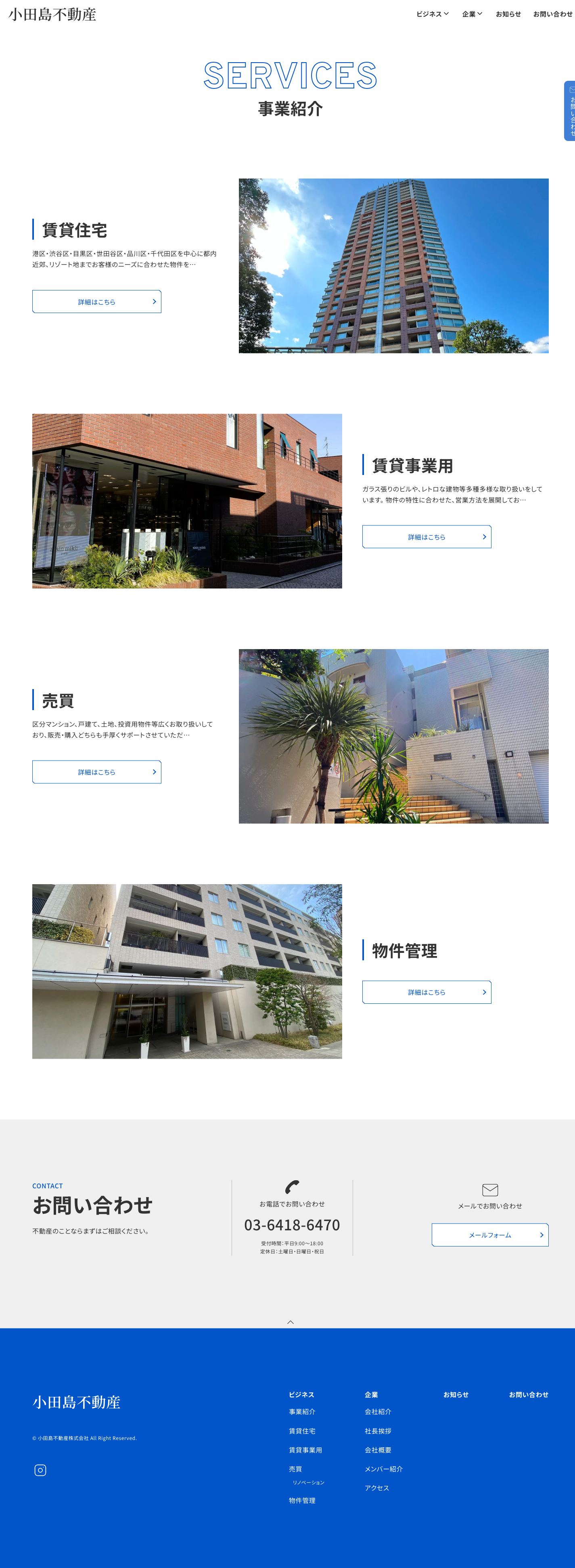
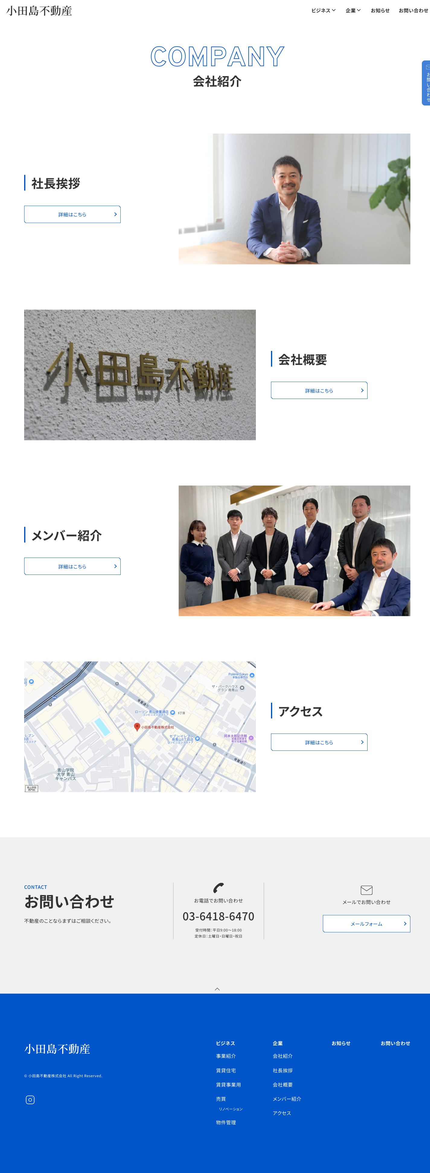
screen.02 — SMARTPHONE
01 / 03Topodaf.co.jp/



// design
Design
City photography that captivates, blue that builds trust.
Photos of a tree-lined avenue and a serif (Mincho) headline convey the company’s vision of connecting people to the city. Text and rules are set in a calm gray, with blue reserved for key elements, creating a simple, focused composition.
- COLOR
- Blue
#0155C8Accent - Base
#333333Text - Gray
#F0F0F0Background - Gray 100
#B5B5B5Secondary - White
#FFFFFFBase
- Blue
- TYPOGRAPHY
- ワクワクと感動をMain copy
Noto Serif JP · 700 - 事業紹介Headings & body text
Noto Sans JP · 700 / 400 - SERVICESEnglish headings (blue outline)
Overpass · 700
- ワクワクと感動をMain copy
- LAYOUT
Content width1280pxSide margins80pxText area (news, etc.)1000pxTwo columns462px each
- SPACING
10px20px24pxBetween elements50pxAbove and below lists60–100pxScales with screen width100–200pxScales with screen width
- COMPONENTS
- Heading
4px vertical bar · 700 / 40px - Button
320 × 57px · Blue border and text - Contact tab
Fixed to the right edge · 42 × 149px
- Heading
- POINTS
- Hero — A full-screen photo of a tree-lined avenue, overlaid with serif copy, makes a strong first impression.
- Headings — Outlined English titles paired with Japanese headings make it clear at a glance which page you are on.
- Contact — A vertical button fixed to the right edge of the screen lets visitors get in touch from any page.
// works.latest(1)
Latest Works
// contact — partner++
Let’s create
something memorable.
Even a rough idea is a great place to start.
Let’s talk it through and find the right direction together.
We work in Japanese, English, and Korean.